# CSS
# Miscellanea
tools
to learn
# Use CSS
# In JS, user agent stylesheets
see HTML notes, BOM DOM notes, JavaScript notes
document.styleSheetsstyleSheets[i].cssRulescssRules[i].cssText(selector & style)cssRules[i].selectorTextelem.styleelem.style.cssText(just style)elem.classNameelem.classListgetComputedStyle(elt: Element, pseudoElt?: string | null): CSSStyleDeclaration
JQuery
$('#element').css('margin', '5px');
$('#element').css({
    margin: "5px",
    padding: "10px",
    color: "black"
});
$('.example-class').css({
    "background-color": "blue",
    fontSize: "10px"
});
user agent stylesheet
# Syntax
value definition syntax — the set of valid values for a CSS property or function
<percentage> | <length> | left | center | right | top | bottom- MDN (opens new window)
- Component value types
- keywords
- Generic keywords — A keyword with a predefined meaning appears literally, without quotation marks
- special keywords — All CSS properties accept the keywords inherit, initial and unset
- literals — In CSS, a few characters can appear on their own, like the slash ('/') or the comma (',')
- data types —
<type>
- keywords
- Component value combinators
[]— group components, transform them as a single component- Juxtaposition — All juxtaposed components are mandatory and should appear in the exact order
&&— all these entities are mandatory but may appear in any order||— at least one of them must be present, and they may appear in any order|— exactly one of these options must be present
- Component value multipliers
*+?{n, m}#— like+but each occurrence is separated by a comma (',')!— the group is required, cannot be empty value
Syntax format
- rules — consists of a selector (e.g.
h1) and declaration block ({}) - Multiple Selectors — apply the same styles to several different elements
- separated by
,, ended by object notation - descendant combinator if separated by space
- separated by
- selectors without any separation — a selector with multiple conditions
- property list — Some properties can take multiple values, collectively known as a property list
- separated by
,, ended by;
- separated by
- comments —
/**/ - index start from 1 —
:nth-child(), etc.
- rules — consists of a selector (e.g.
shorthand — set several rules simultaneously
- separated by space for each rule
- separate by
/for two-value properties - usually clockwise, or horizontal to vertical
- T, RL, B for triplets
- when certain values omitted, they’ll be set implicitly to their initial value
# CSS data type
- data types — typical values (including keywords and units) accepted by CSS properties and functions
# String and URL
<string>- single or double quote
- unicode
\escaped characters\A,\00000A\22—\u0022
- multiline string, escape with
\as in Python
<url>url("http://mysite.example.com/mycursor.png") url('http://mysite.example.com/mycursor.png') url(http://mysite.example.com/mycursor.png)- Relative URLs — relative to the URL of the stylesheet
# Number related
calc()— be used anywhere a<length>,<frequency>,<angle>,<time>,<percentage>,<number>, or<integer>is allowed- Math expressions involving percentages for widths and heights on table columns, table column groups, table rows, table row groups, and table cells in both auto and fixed layout tables may be treated as if
autohad been specified. - It is permitted to nest
- Math expressions involving percentages for widths and heights on table columns, table column groups, table rows, table row groups, and table cells in both auto and fixed layout tables may be treated as if
<number>— an integer or a number with a fractional component12 A raw <integer> is also a <number>. 4.01 Positive fraction -456.8 Negative fraction 0.0 Zero +0.0 Zero, with a leading + -0.0 Zero, with a leading - .60 Fractional number without a leading zero 10e3 Scientific notation -3.4e-2 Complicated scientific notation<integer>— a type of<number>- pure numbers, with
+or-optionally - something like scientific, hex or bin is not allowed
- pure numbers, with
- for
line-height,<number>is favored than<length>, because computed value is inherited for<length>
<percentage>—<number>followed by%<angle>— a<number>followed by one of the unitsdeg— degreegrad— gradians,100gradis equivalent to90degradturn—1turnis equivalent to360deg
<length>— a<number>followed by one of the units- font-relative
rem— the font-size of the root element (typically<html>(:root))em— calculatedfont-sizeof the element. If used on thefont-sizeproperty itself, it represents the inherited font-size of the element.- computed value can be different for
font-sizeand other properties
- computed value can be different for
ex— the x-height, generally the height of x of the font, typically 1ex ≈ 0.5emcap— cap height of the fontch— the width, or more precisely the advance measure, of the glyph "0" (zero, the Unicode character U+0030) in the element'sfontic— the used advance measure of the "水" (CJK water ideograph, U+6C34)lh— computed value of theline-heightpropertyrlh— computed value of the line-height property on the root element (typically<html>)
- viewport-relative
vh— Equal to 1% of the height of the viewport's initial containing block.vw— Equal to 1% of the width of the viewport's initial containing block.vi— Equal to 1% of the size of the initial containing block, in the direction of the root element’s inline axis.vb— Equal to 1% of the size of the initial containing block, in the direction of the root element’s block axis.vmin— Equal to the smaller of vw and vh.vmax— Equal to the larger of vw and vh.
- absolute
px— one pixel- For screen displays, it traditionally represents one device pixel (dot)
- However, for printers and high-resolution screens, one CSS pixel implies multiple device pixels (
window.devicePixelRatio)
cm— One centimeter. 1cm = 96px/2.54.mm— One millimeter. 1mm = 1/10th of 1cm.in— One inch. 1in = 2.54cm = 96px.pc— One pica. 1pc = 12pt = 1/6th of 1in.pt— One point. 1pt = 1/72nd of 1in.Q— One quarter of a millimeter. 1Q = 1/40th of 1cm.
- font-relative
<length-percentage>—<length> | <percentage>use of
<length>— Font Shrinking for relative<length>ul { font-size: .8em; /* culprit */ } ul ul { font-size: 1em; /* possible correction */ }- should use
remforfont-size - some recommendation — use rems for font sizes, pixels for borders, and ems for most other measures, especially paddings, margins, and border radius (though I favor the use of percentages for container widths when necessary)
- should use
<time>—<number>followed bysms
# Color
<color><rgb()> | <rgba()> | <hsl()> | <hsla()> | <hex-color> | <named-color> | currentColor | <deprecated-system-color>- color keywords
transparentcurrentColor— take the inherited value- defined in CSS Level 1 —
black#000000,silver#c0c0c0,gray#808080,white#ffffff,maroon#800000,red#ff0000,purple#800080,fuchsia#ff00ff,green#008000,lime#00ff00,olive#808000,yellow#ffff00,navy#000080,blue#0000ff,teal#008080,aqua#00ffff. - CSS Level 2 —
orange#ffa500 - more
- RBG — hexadecimal and functional notations
<rgb()> = rgb( <percentage>{3} [ / <alpha-value> ]? ) | rgb( <number>{3} [ / <alpha-value> ]? ) | rgb( <percentage>#{3} , <alpha-value>? ) | rgb( <number>#{3} , <alpha-value>? ) <alpha-value> = <number> | <percentage> #RRGGBB[AA] #RGB[A] rgb(R, G, B[, A]) or rgba(R, G, B, A) /* <integer> or <percentage>, space are optional */ rgb(R G B[ A]) or rgba(R G B A) /* CSS Level 4 */A(alpha) can be a<number>between 0 and 1, or a<percentage>, where the number 1 corresponds to 100% (full opacity)R,G,Bin functional notations must have the same data type- allow floats in functional — CSS Level 4
- HLS — hue, saturation, and lightness
hsl(H, S, L[, A]) or hsla(H, S, L, A)
hsl(H S L[ A]) or hsla(H S L A)        /* CSS Level 4 */
- color keywords
<blend-mode>— how colors should appear when elements overlapnormal | multiply | screen | overlay | darken | lighten | color-dodge | color-burn | hard-light | soft-light | difference | exclusion | hue | saturation | color | luminosity
# Image
<image><image> = <url> | <image()> | <image-set()> | <element()> | <cross-fade()> | <gradient>- the first is at the top if multiple
- examples
url(test.jpg)               /* A <url>, as long as test.jpg is an actual image */
linear-gradient(blue, red)  /* A <gradient> */
element(#realid)            /* CSS Level 4 */
<image()>—image()function experimentalimage( <image-tags>? [ <image-src>? , <color>? ]! ) where <image-tags> = ltr | rtl <image-src> = <url> | <string> <color> = <rgb()> | <rgba()> | <hsl()> | <hsla()> | <hex-color> | <named-color> | currentcolor | <deprecated-system-color>- it is similar to
<url>, but can- specifying the image's directionality
- specifying fallback
- displaying just a part of that image defined by a media fragment
- it is similar to
<image-set()>—image-set()function experimentalimage-set() = image-set( <image-set-option># ) where <image-set-option> = [ <image> | <string> ] <resolution>- a method of letting the browser pick the most appropriate CSS image from a given set, primarily for high pixel density screens
<string>represents an<url>
<element()>—element()function experimentalelement(id)- an
<image>value generated from an arbitrary HTML element
- an
cross-fade()function experimentalcross-fade( <cf-mixing-image> , <cf-final-image>? ) where <cf-mixing-image> = <percentage>? && <image> <cf-final-image> = <image> | <color>- blend two or more images at a defined transparency.
<gradient>— concrete size will match the size of the element to which it applies<linear-gradient()> | <repeating-linear-gradient()> | <radial-gradient()> | <repeating-radial-gradient()> | <conic-gradient()>linear-gradient()syntax examplelinear-gradient( [ <angle> | to <side-or-corner> ,]? <color-stop> [, <color-stop>]+ ) \---------------------------------/ \----------------------------/ Definition of the gradient line List of color stops where <side-or-corner> = [left | right] || [top | bottom] and <color-stop> = <color> [ <percentage> | <length> ]?/* A gradient tilted 45 degrees, starting blue and finishing red */ linear-gradient(45deg, blue, red); /* A gradient going from the bottom right to the top left corner, starting blue and finishing red */ linear-gradient(to left top, blue, red); /* A gradient going from the bottom to top, starting blue, turning green at 40% of its length, and finishing red */ linear-gradient(0deg, blue, green 40%, red);to— defaults toto bottom, can betop,left,right, or the combination<angle>—0degisto top, increasing clockwise<color-stop>—<color>with optional stop position, either a<percentage>or a<length>along the gradient's axis
repeating-linear-gradient()— similar tolinear-gradient()and takes the same arguments, but it repeats the color stops infinitely in all directions so as to cover its entire containerradial-gradient()— circle or ellipserepeating-radial-gradient()— similar toradial-gradient()and takes the same arguments, but it repeats the color stops infinitely in all directions so as to cover its entire container
# Variables
<custom-property-name>- starts with two dashes
- must be declared inside a declaration block (
:root) - use —
var( <custom-property-name> , <declaration-value>* )- fallback value
<declaration-value>can be one or more
- fallback value
- Custom properties are scoped to the element(s) they are declared on, and participate in the cascade
- You can define a variable as black, for example, and then redefine it as white inside a particular container. Then, any styles based on that variable will dynamically resolve to black if they are outside the container and to white if inside
- with JavaScript
CSSStyleDeclaration.getPropertyValue(property: string): stringCSSStyleDeclaration.setProperty()
# Media Queries
<media-query-list><media-query-list> = <media-query>#list-of-media-queries— Is a comma-separated list of media queries conditioning the application of the CSS rules- example
@media (min-height: 680px), screen and (orientation: portrait) { ... }
<media-query><media-condition> | [ not | only ]? <media-type> [ and <media-condition-without-or> ]? where <media-condition> = <media-not> | <media-and> | <media-or> | <media-in-parens> <media-type> = <ident> <media-condition-without-or> = <media-not> | <media-and> | <media-in-parens> where <media-not> = not <media-in-parens> <media-and> = <media-in-parens> [ and <media-in-parens> ]+ <media-or> = <media-in-parens> [ or <media-in-parens> ]+ <media-in-parens> = ( <media-condition> ) | <media-feature> | <general-enclosed> where <media-feature> = ( [ <mf-plain> | <mf-boolean> | <mf-range> ] ) <general-enclosed> = [ <function-token> ( <any-value> ) ] | ( <ident> <any-value> ) where <mf-plain> = <mf-name> : <mf-value> <mf-boolean> = <mf-name> <mf-range> = <mf-name> [ '<' | '>' ]? '='? <mf-value> | <mf-value> [ '<' | '>' ]? '='? <mf-name> | <mf-value> '<' '='? <mf-name> '<' '='? <mf-value> | <mf-value> '>' '='? <mf-name> '>' '='? <mf-value> where <mf-name> = <ident> <mf-value> = <number> | <dimension> | <ident> | <ratio>media types
allprintscreenspeech
media features
widthheight- more
# At Rule
At-rule — a CSS statement that instructs CSS how to behave, begin with
@/* General structure */ @IDENTIFIER (RULE); /* Example: tells browser to use UTF-8 character set */ @charset "utf-8";@import— import style rules from other style sheets- Syntax
@import [ <string> | <url> ] [ <media-query-list> ]?; - must precede all other types of rules, except
@charsetrules - cannot be used inside conditional group at-rules
- Syntax
@media— apply part of a style sheet based on the result of one or more media queries, see Media Queries@media <media-query-list> { <group-rule-body> }example
@media only screen and (min-width: 320px) and (max-width: 480px) and (resolution: 150dpi) { body { line-height: 1.4; } }- in JavaScript —
CSSMediaRuleCSSOM
- in JavaScript —
@supports— specify declarations that depend on a browser's support for one or more specific CSS features@supports <supports-condition> { <group-rule-body> }example
@supports (transform-style: preserve) or (-moz-transform-style: preserve) or (-o-transform-style: preserve) or (-webkit-transform-style: preserve) {} @supports (transform-style: preserve-3d) or ((-moz-transform-style: preserve-3d) or ((-o-transform-style: preserve-3d) or (-webkit-transform-style: preserve-3d))) {}@page— modify some CSS properties when printing a document; can only change the margins, orphans, widows, and page breaks@page <page-selector-list> { <page-body> }
# Selectors
selector — identify specific HTML elements as targets for CSS styles
- similar to XPATH
- MDN (opens new window)
priority
- by CSS origin
- user agent
- author
- user
- by specificity — by which browsers decide which CSS property values are the most relevant to an element and, therefore, will be applied
- later defined is more specific
- directly targeted is more specific than inherited
- selector type, ascending order
- Type selectors, and pseudo-elements, 1.
- Class selectors, attributes selectors, and pseudo-classes, 1-0.
- ID selectors, 1-0-0.
style=attribute, 1-0-0-0.
- exception
!important, 1-0-0-0-0:not()is not considered pseudo-class, specificity up to its parameters- Tree proximity ignorance —
html h1more specific thanbody h1if it comes later
- rules of thumb — careful with
#idand!important
- by CSS origin
Simple selectors
- type selector
div— HTML tag name - class selector
.class-name - ID selector
#id - universal selector
*- tbd
- attribute selector
[attr][attr]— Represents elements with an attribute name ofattr.[attr=value]— exact[attr~=value]— among the space separated list[attr|=value]— exact or before hyphendiv[lang|="zh"]for divs withzh-CNandzh-TW
[attr^=value]— begin with[attr$=value]— end with[attr*=value]— contains[... i]— Adding an i (or I) before the closing bracket, ignore case
- type selector
Combinators — between two selectors
- adjacent sibling combinator
+— matches the second element only if it is the immediate sibling - general sibling combinator
~— all siblings that follow the specified element - child combinator
>— select elements that are children of the specified element - descendant combinator
space— selects elements that are a descendant of the defined element - column combinator
||experimental - combinators can have preceding and trailing spaces
- adjacent sibling combinator
Pseudo-classes — allow the selection of elements based on state information that is not contained in the document tree
- select selector
:not( <complex-selector-list> ) where <complex-selector-list> = <complex-selector># where <complex-selector> = <compound-selector> [ <combinator>? <compound-selector> ]* where <compound-selector> = [ <type-selector>? <subclass-selector>* [ <pseudo-element-selector> <pseudo-class-selector>* ]* ]! <combinator> = '>' | '+' | '~' | [ '||' ]:has()experimental:matches()— takes a selector list as its argument, and selects any element that can be selected by one of the selectors in that list:not()— elements that do not match a list of selectors- The ability to list more than one selector is experimental and not yet widely supported
- Child Pseudo Class
:empty— any element that has no children. Children can be either element nodes or text (including whitespace):first-child— first element among a group of sibling elements:last-child:only-child— an element without any siblings, the same as:first-child:last-child:nth-child()odd,even<An+B>— all possible values for n ≥ 0
:nth-last-child()—:nth-child()with counting from last child with index 1:root—html
- type pseudo class
:first-of-type— the first element of its type among a group of sibling elements:last-of-type:only-of-type:nth-of-type()— refer to:nth-child():nth-last-of-type()
- use interaction
:hover— the user interacts with an element with a pointing device, but does not necessarily activate it:focus:focus-visible—:focusand the UA determines via heuristics that the focus should be made evident on the element. (Many browsers show a “focus ring” by default in this case.):focus-within— has received focus or contains an element that has received focus:readonly,:read-write:fullscreen:indeterminate:target— a unique element (the target element) with anidmatching the URL's fragment
- link related — use LVHA-order to prevent unexpected override
:link— an element that has not yet been visited- matches every unvisited
<a>,<area>, or<link>element that has anhrefattribute
- matches every unvisited
:visited— links that the user has already visited:hover— see before:active— an element (such as a button) that is being activated by the user:any-link— all elements that match:linkor:visited
<form>related:valid,:invalid:checked— radio, checkbox, option:default:disabled,:enabled:optional,:required:placeholder-shown<input>:in-range— an<input>element whose current value is within the range limits specified by the min and max attributes:out-of-range
- language —
:lang() - custom element —
:defined— any element that has been defined, standard and custom withCustomElementRegistry.define() - shadow DOM — tbd
@page:first:left:right
- select selector
Pseudo-elements — a specific part of the selected element(s)
- can use only one pseudo-element in a selector
- must appear after the simple selectors in the statement
contentis required for pseudo-elements to render, can becontent: "":for old browsers- generally for IE
- position
::before(:before) — creates the first child of the selected element
::after(:after) — creates the last child of the selected element- inline by default
- contained by the element's formatting box, and thus don't apply to replaced elements such as
<img>, or to<br>elements
::first-line(:first-line) — the first line of a block-level element- a small subset of CSS properties can be applied — font-related, background-related,
color, text-related
- a small subset of CSS properties can be applied — font-related, background-related,
::first-letter(:first-letter) — the first letter of the first line of a block-level element, but only when not preceded by other content (such as images or inline tables)- a small subset of CSS properties can be applied — font-related, background-related,
color, text-related, margin, padding, border, etc.
- a small subset of CSS properties can be applied — font-related, background-related,
::marker— the marker box of a list item, which typically contains a bullet or number- applicable rules are limited
li::before
::placeholder- can only apply rules that applicable to
::first-line
- can only apply rules that applicable to
- user interaction
::selection— the part of a document that has been highlighted by the user- rules can be applied —
color,background-color,cursor,caret-color,outlineand its longhands,text-decorationand its associated properties,text-emphasis-color,text-shadow
- rules can be applied —
::grammar-errorexperimental::spelling-errorexperimental
- other
::backdrop— a box the size of the viewport which is rendered immediately beneath any element being presented in full-screen modedialog::backdrop { background: rgba(255,0,0,.25); }::slotted()— for<template>and<slot>::cue— WebVTT cues within a selected element- applicable rules are limited
# Examples
vertical centering
- Generator (opens new window)
- use CSS table, flexbox, grid
- natural height container — apply an equal top and bottom padding to the container
- fixed height container or avoid padding —
display: table-cellandvertical-align: middle - one line text — set a tall line height equal to the desired container height
- If the contents aren’t inline, you may have to set them to
inline-block
- If the contents aren’t inline, you may have to set them to
- height known — absolute positioning
spacing elements within a container
- use adjacent sibling combinator
+andmargin-top - the lobotomized owl selector
body * + *andmargin-top
- use adjacent sibling combinator
universal border-box fix — see after
-
- key properties —
border,transform - example: dropdown triangle
.dropdown-label::after {
  content: "";
  position: absolute;
  right: 1em;
  top: 1em;
  border: 0.3em solid;
  border-color: black transparent transparent;
}
- key properties —
# Common UI Components
Typography
font-weight— theme controlled light 300, regular 400, medium 500font-sizeline-heightletter-spacingtext-transform
Paper
- themed
background-color border-radius, by theme- elevation — three levels of black
box-shadowwith decreasing alpha value.level2 { box-shadow: 0px 1px 5px 0px rgba(0,0,0,0.2), 0px 2px 2px 0px rgba(0,0,0,0.14), 0px 3px 1px -2px rgba(0,0,0,0.12); } .level23 { box-shadow: 0px 10px 14px -6px rgba(0,0,0,0.2), 0px 22px 35px 3px rgba(0,0,0,0.14), 0px 8px 42px 7px rgba(0,0,0,0.12); }
- themed
TouchRipple
- a inner
<span>with absolute position, 100% width and height,border-radius: 50%, limited byoverflow: hidden @keyframes{ '@keyframes mui-ripple-enter': { '0%': { transform: 'scale(0)', opacity: 0.1, }, '100%': { transform: 'scale(1)', opacity: 0.3, }, }, rippleVisible: { opacity: 0.3, transform: 'scale(1)', animation: `mui-ripple-enter ${DURATION}ms ${theme.transitions.easing.easeInOut}`, }, }- some more
keyframes
- some more
- a inner
# App bar
App bar
<Paper square component="header" elevation={4} className={className} {...other}> {children} </Paper>- position — as a prop, when
stickyorabsolute, settopandrightto 0 background-colorandcolor, theme controlledz-index— a high value, like 1100- flex layout with
flex-direction: columnto stretch to full width (align-itemsdefaults tonormal, which is equivalent tostretchin flex layout) - items at two side — a flex container as the child (toolbar), and the last item of the left side with
flex-grow: 1 - other properties
box-sizing: border-box,width: 100%,flex-shrink: 0
- position — as a prop, when
tool bar — used by app bar
<div>withdisplay: flexandalign-items: centermin-height- gutters — switch on and off in props
export default function createMixins(breakpoints, spacing, mixins) {
  return {
    gutters: (styles = {}) => ({
      paddingLeft: spacing.unit * 2,
      paddingRight: spacing.unit * 2,
      ...styles,
      [breakpoints.up('sm')]: {
        paddingLeft: spacing.unit * 3,
        paddingRight: spacing.unit * 3,
        ...styles[breakpoints.up('sm')],
      },
    }),
    toolbar: {
      minHeight: 56,
      [`${breakpoints.up('xs')} and (orientation: landscape)`]: {
        minHeight: 48,
      },
      [breakpoints.up('sm')]: {
        minHeight: 64,
      },
    },
    ...mixins,
  };
}
# Avatars
- avatar
- container in props, defaults to
<div> - centering for container —
display: flexwithalign-itemsandjustify-contentset tocenter - circular image —
border-radius: 50%and fixed width and height (40px) in the container andoverflow: hidden - letter avatars —
background-color,user-select: none,font-family, andfont-sizeset to half of height - image — width and height set to 100% and
object-fit: cover
- container in props, defaults to
# Badge
- badge
<ComponentProp className={classNames(classes.root, className)} {...other}> {children} <span className={badgeClassName}>{displayValue}</span> </ComponentProp>- root container — defaults to
<span>.root { display: inline-flex; position: relative; vertical-align: middle; /* For correct alignment with the text. */ } - centering — use flex for centering, also
flex-wrapandalign-content - positioning
position: absolute,rightandtopset to 0transform: scale(1) translate(50%, -50%)box-sizing: border-box
z-index: 1— Render the badge on top of potential ripples.
- font — medium weight, 12px size
- padding —
0 4px, keep literals away from round border - sizing —
heightandmin-widthset to 2 times ofborder-radius - coloring —
colorandbackground-color, theme controlled - dot — override
heightandmin-heightto 6px andpaddingto 0border-radiusare capped at 50%
- transition —
transition: transform 225ms cubic-bezier(0.4, 0, 0.2, 1) 0ms - invisible —
transform: scale(0)and transition{ invisible: { transition: theme.transitions.create('transform', { easing: theme.transitions.easing.easeInOut, duration: theme.transitions.duration.leavingScreen, }), transform: 'scale(0) translate(50%, -50%)', transformOrigin: '100% 0%', }, }
- root container — defaults to
# Button
- ButtonBase
// event handlers and some other properties omitted // event handlers mainly for the coordination of the ripple effect <ComponentProp> {children} {!disableRipple && !disabled ? ( <NoSsr> {/* TouchRipple is only needed client side, x2 boost on the server. */} <TouchRipple innerRef={this.onRippleRef} center={centerRipple} {...TouchRippleProps} /> </NoSsr> ) : null} </ComponentProp>- override default
<button>styleappearance: none— override default<button>UA style, vender prefixed-webkit-tap-highlight-color: transparentbackground-color: transparent— overridebuttonfacecoloroutline: none— no focus ringborder,margin,padding,border-radiusset to 0text-decoration: none— take precedent over the style of a native<a/>element
- centering and positioning
.root { display: inline-flex; align-items: center; justify-content: center; position: relative; vertical-align: middle; } - user interaction
.root { user-select: none; cursor: pointer; } - when disabled
.root.disabled {
  pointer-events: none;
  cursor: default;
}
- override default
# Rules
# Notable Keywords
special values
- universally applicable
inherit— by default, properties pertaining to text, list properties, table border properties inheritsinitial— applies the initial (or default) value- for inherited properties — the initial value is used on the root element only, as long as no specified value is supplied
- for non-inherited properties — the initial value is used on all elements, as long as no specified value is supplied
unset— resets a property to its inherited value if it inherits from its parent, and to its initial value if notrevert— rolls back the cascade so that a property takes on the value it would have had if there were no styles in the current style origin (author, user, or user-agent)!important— overrides any other declarationsinput[type="password" i] { -webkit-text-security: disc !important; }- for global rule, avoid use if possible
- common, but not for all
auto— adjusted automatically according to the content or the context of the elementnonenormalstartandend— relative to direction
- HTML related
attr()— retrieve the value of an attribute of the selected HTML element and use it in the stylesheetattr( <attr-name> <type-or-unit>? [, <attr-fallback> ]? ) where <type-or-unit> = string | color | url | integer | number | length | angle | time | frequency | cap | ch | em | ex | ic | lh | rlh | rem | vb | vi | vw | vh | vmin | vmax | mm | Q | cm | in | pt | pc | px | deg | grad | rad | turn | ms | s | Hz | kHz | %
- universally applicable
special properties
all— sets all of an element's properties (other thanunicode-bidianddirection)initial | inherit | unset | revert- logical properties and values — use the abstract terms
blockandinlineto describe the direction in which they flow- MDN (opens new window)
- block — the dimension perpendicular to the flow of text within a line
- inline — the dimension parallel to the flow of text within a line
# Box Styling
box model and the containing block
- MDN (opens new window)
- box model
- content box
- padding box
- border box
- margin box, transparent
- containing block — most often, the containing block is the content area of an element's nearest block-level ancestor
- affected by
position— whenpositionisfixedorabsolute, the containing box changes
- affected by
choose box for width and height properties
box-sizing— width and height properties apply to/* universal border-box fix */ :root { box-sizing: border-box; } *, ::before, ::after { box-sizing: inherit; }content-box— default, padding, border and margin not includedborder-box— include content, padding, border, not margin
widthandheightmin-widthandmin-heightmax-widthandmax-width- possible values
<length><percentage>auto
- possible experimental values
max-content— The intrinsic preferred width.min-content— The intrinsic minimum width.fill— Use the fill-available inline size or fill-available block size, as appropriate to the writing mode.fill-available— The containing block's width minus the horizontal margin, border, and padding. (Note that some browsers implement an ancient name for this keyword,available.)fit-content— Defined asmin(max-content, max(min-content, fill-available)).
shorthand order
/* Apply to all four sides */
margin: -3px;
/* vertical | horizontal */
margin: 5% auto;
/* top | horizontal | bottom */
margin: 1em auto 2em;
/* top | right | bottom | left */
margin: 2px 1em 0 auto;
# Margins
margins
margin-topmargin-bottommargin-leftmargin-rightmargin- values
<length><percentage>- can be negative
auto- used for horizontal centering in old browsers
margin collapsing — top and bottom margins sometimes combine and only the larger applies
- occurs when
- Adjacent siblings — The margins of adjacent siblings are collapsed (except when the latter sibling needs to be cleared past floats).
- Parent and first/last child — collapse if nothing to separate the margin between the parent and child
- empty blocks — if no separation the top and bottom margin of a block will collapse
- margin collapse on some conditions
- above cases can combine
- These rules apply even to margins that are zero
- When negative margins are involved, the size of the collapsed margin is the sum of the largest positive margin and the smallest (most negative) negative margin
- When all margins are negative, the size of the collapsed margin is the smallest (most negative) margin
- prevent margin collapse
- floating and absolutely positioned elements never collapse
- Margins won’t collapse to the outside of a container that is floated, that is an inline block, or that has an absolute or fixed position.
- margins of flexbox items and grid items don’t collapse
- Adding a border or padding between two margins stops them from collapsing
- Applying
overflow: auto(or any value other than visible ) to the container prevents margins inside the container from collapsing with those outside the container - Elements with a
table-celldisplay don’t have a margin, so they won’t collapse. This also applies totable-rowand most other table display types. Exceptions aretable,table-inline, andtable-caption display: tableimplicitly creates a table row within the element and a table cell within that, so margins will not collapse through
- occurs when
negative margin, auto margin
- negative
- left or top — moves the element leftward or upward, respectively. This can cause the element to overlap another element preceding it in the document flow
- right or bottom — pulls in any succeeding element
- can render some elements unclickable if they’re moved beneath other elements
- auto horizontal margin — Auto left and right margins will grow to fill the available space, centering the element within the outer container.
- negative
# padding, border, outline and box shadows
padding
padding-toppadding-rightpadding-bottompadding-leftpadding- value
<length><percentage>- no negative
Multiple Borders
borderbox-shadow— shadow effects around an element's frameoutline- pseudo element
border<line-width> || <line-style> || <color>border-width<line-width>{1,4} where <line-width> = <length> | thin | medium | thickborder-style<line-style>{1,4} where <line-style> = none | hidden | dotted | dashed | solid | double | groove | ridge | inset | outsetborder-color—<color>{1, 4}border-[trbl],[trbl] = top | right | bottom | leftborder-[trbl]-colorborder-[trbl]-styleborder-[trbl]-width
- CSS shapes — adjacent borders are divided evenly
#triangle-up {
  width: 0;
  height: 0;
  border-left: 50px solid transparent;
  border-right: 50px solid transparent;
  border-bottom: 100px solid red;
}
#triangle-topleft {
  width: 0;
  height: 0;
  border-top: 100px solid red;
  border-right: 100px solid transparent;
}
border-radius<length-percentage>{1,4} [ / <length-percentage>{1,4} ]?- also applies to background
- shorthand for
border-bottom-left-radiusborder-bottom-right-radiusborder-top-left-radiusborder-top-right-radius
border-image<'border-image-source'> || <'border-image-slice'> [ / <'border-image-width'> | / <'border-image-width'>? / <'border-image-outset'> ]? || <'border-image-repeat'>border-image-sourcenone | <image>border-image-slice— divides the image by a 3×3 grid<number-percentage>{1,4} && fill?border-image-width[ <length-percentage> | <number> | auto ]{1,4}border-image-outset— the distance by which an element's border image is set out from its border box for each side[ <length> | <number> ]{1,4}border-image-repeat— how the edge regions of a source image are adjusted to fit the dimensions[ stretch | repeat | round | space ]{1,2}
outlineandoutline-offset<'outline-color'> || <'outline-style'> || <'outline-width'>- outline vs border
- outline never take up space
- outlines don't have to be rectangular, although they usually are
outline-color<color> | invertoutline-styleauto | <'border-style'>outline-width<line-width> where <line-width> = <length> | thin | medium | thickoutline-offset<length>
- outline vs border
box-shadownone | <shadow># where <shadow> = inset? && <length>{2,4} && <color>?- tool (opens new window)
inset- a drop shadow (as if the box were raised above the content)
- or drawn inside the border (even transparent ones), above the background, but below content, where the shadow box does not cover is drawn
<length>{2, 4}—offset-x | offset-y | blur-radius | spread-radius
# Background
background[ <bg-layer> , ]* <final-bg-layer> where <bg-layer> = <bg-image> || <bg-position> [ / <bg-size> ]? || <repeat-style> || <attachment> || <box> || <box> <final-bg-layer> = <'background-color'> || <bg-image> || <bg-position> [ / <bg-size> ]? || <repeat-style> || <attachment> || <box> || <box>background-image<bg-image># where <bg-image> = none | <image>- stacking one or more images — The background images are drawn on stacking context layers on top of each other. The first layer specified is drawn as if it is closest to the user.
- The borders of the element are then drawn on top of them
- and the background-color is drawn beneath them
background-position<bg-position># one value: left | center | right | top | bottom | <length-percentage> two value: [ left | center | right | <length-percentage> ] [ top | center | bottom | <length-percentage> ] two value: [ center | [ left | right ] <length-percentage>? ] && [ center | [ top | bottom ] <length-percentage>? ]- sets the initial position for each background image. The position is relative to the position layer set by background-origin
- one value — The other dimension is then set to 50%
<length-percentage>sets the X coordinate relative to the left edge
background-size— the size of background images relative to container<bg-size># where <bg-size> = [ <length-percentage> | auto ]{1,2} | cover | containbackground-repeat— A background image can be repeated along the horizontal and vertical axes, or not repeated at all<repeat-style># where <repeat-style> = repeat-x | repeat-y | [ repeat | space | round | no-repeat ]{1,2}repeat-x—repeat no-repeatrepeat-y—no-repeat repeat
background-attachment— position is fixed within the viewport, or scrolls with its containing block<attachment># where <attachment> = scroll | fixed | localbackground-origin— image position<box># where <box> = border-box | padding-box | content-boxbackground-clip— whether background extends underneath its border<box># where <box> = border-box | padding-box | content-boxtext— experimental
background-color— rendered behindbackground-image,<color>background-blend-mode— not in shorthand, how an element's background images should blend with each other and with the element's background color.<blend-mode>#
# font
font concepts
- wikipedia (opens new window)
- baseline — bottom of letter
e - mean line — top of regular lowercase glyphs
- x-height — baseline to mean line
- cap line — the top of the ascent or a regular uppercase glyphs
- cap height — baseline to cap line
- ascender — the part of a glyph rising above the x-height (like the upper part of letter
b) - ascent — distance between baseline and ascender
- descender — the part of a glyph that descends below the baseline (like the lower part of letter
p) - descent — distance between base and descender
- font size — ??
- leading — the space between the descent of one line and the ascent of the next line
- line height — distance between adjacent baselines
font[ [ <'font-style'> || <font-variant-css21> || <'font-weight'> || <'font-stretch'> ]? <'font-size'> [ / <'line-height'> ]? <'font-family'> ] | caption | icon | menu | message-box | small-caption | status-bar where <font-variant-css21> = [ normal | small-caps ]- System font values
caption— The system font used for captioned controls (e.g., buttons, drop-downs, etc.).icon— The system font used to label icons.menu— The system font used in menus (e.g., dropdown menus and menu lists).message-box — The system font used in dialog boxes.small-caption— The system font used for labeling small controls.status-bar— The system font used in window status bars.
- System font values
font-stylenormal | italic | oblique <angle>?- Italic font faces are generally cursive in nature, usually using less horizontal space than their unstyled counterparts, while oblique faces are usually just sloped versions of the regular face.
font-variant— shorthand, but usually only the CSS Level 2 (Revision 1) values offont-variant, (that is,normalorsmall-caps)font-variant-capsnormal | small-caps | all-small-caps | petite-caps | all-petite-caps | unicase | titling-capsfont-variant-alternatesfont-variant-east-asianfont-variant-ligaturesfont-variant-numericfont-variant-positionfont-variation-settings
font-weight— the weight (or boldness) of the font<font-weight-absolute> | bolder | lighter where <font-weight-absolute> = normal | bold | <number>bolderandlighterrelative to the parent- level — 100, 400 (
normal), 700 (bold), 900
font-stretchexperimentalfont-size<absolute-size> | <relative-size> | <length-percentage> where <absolute-size> = xx-small | x-small | small | medium | large | x-large | xx-large <relative-size> = larger | smallerline-heightnormal | <number> | <length> | <percentage>normal—1.2
font-family[ <family-name> | <generic-family> ]# where <family-name> = <string> | <custom-ident>+ <generic-family> = serif | sans-serif | cursive | fantasy | monospace@font-face— specifies a custom font@font-face { [ font-family: <family-name>; ] || [ src: <src>; ] || [ unicode-range: <unicode-range>; ] || [ font-variant: <font-variant>; ] || [ font-feature-settings: <font-feature-settings>; ] || [ font-variation-settings: <font-variation-settings>; ] || [ font-stretch: <font-stretch>; ] || [ font-weight: <font-weight>; ] || [ font-style: <font-style>; ] } where <family-name> = <string> | <custom-ident>+
# more about font
font-smooth— non-standardhtml { -webkit-font-smoothing: antialiased; -moz-osx-font-smoothing: grayscale; }- Feel free to use it on light text on dark backgrounds, feel free to use it to fix custom font rendering on Windows or to style specific bits of text
more
# writing mode
writing-mode— sets whether lines of text are laid out horizontally or vertically, as well as the direction in which blocks progresshorizontal-tb | vertical-rl | vertical-lr | sideways-rl | sideways-lrdirection— sets the direction of text, table columns, and horizontal overflowltr | rtl- text direction is usually defined within a document (e.g., with HTML's
dirattribute) - The
directionandunicode-bidiproperties are the two only properties which are not affected by theallshorthand property
- text direction is usually defined within a document (e.g., with HTML's
unicode-bidi— how bidirectional text in a document is handled- This property is intended for Document Type Definition (DTD) designers. Web designers and similar authors should not override it.
- The
directionandunicode-bidiproperties are the two only properties which are not affected by theallshorthand property
# text
# text style
color— sets the foreground color value of an element's text and text decorations, and sets thecurrentColorvalue.<color>text decoration
text-decoration— not inherited by default, see text emphasis<'text-decoration-line'> || <'text-decoration-style'> || <'text-decoration-color'>text-decoration-line— the kind of decorationnone | [ underline || overline || line-through]text-decoration-style— the style of the linessolid | double | dotted | dashed | wavytext-decoration-color— the color of decorations<color>
text-underline-position— the position of the underline which is set using thetext-decorationproperty's underline valueauto | [ under || [ left | right ] ]
text-transform— how to capitalize an element's textnone | capitalize | uppercase | lowercase | full-widthtext emphasis
text-emphasis— applies emphasis marks to text (except spaces and control characters)<'text-emphasis-style'> || <'text-emphasis-color'>- quite different from
text-decorationtext-decorationproperty does not inherit, and the decoration specified is applied across the whole elementtext-emphasisdoes inherit, which means it is possible to change emphasis marks for descendents- The size of the emphasis symbol, like ruby symbols, is about 50% of the size of the font, and may affect line height
text-emphasis-stylenone | [ [ filled | open ] || [ dot | circle | double-circle | triangle | sesame ] ] | <string>text-emphasis-color<color>
- quite different from
text-emphasis-position[ over | under ] && [ right | left ]- for horizontal writing mode and vertical write mode
text-shadow— adds shadows to text. It accepts a comma-separated list of shadows to be applied to the text and any of its decorationsnone | <shadow-t># where <shadow-t> = [ [ <offset-x> <offset-y> <blur-radius>? ] && <color>? ] where <offset-x> = <length> <offset-y> = <length> <blur-radius> = <length>
# text align
horizontal align
text-align— horizontal alignment of an inline or table-cell boxleft | right | center | justify- experimental —
start | end | left | right | center | justify | match-parent text-justify— what type of justificationauto | inter-character | inter-word | none
- experimental —
text-align-last— how the last line of a block or a line, right before a forced line break, is alignedauto | start | end | left | right | center | justify
vertical-align— an inline or table-cell boxbaseline | sub | super | text-top | text-bottom | middle | top | bottom | <percentage> | <length>- negative allowed
# text spacing and overflow
spacing
letter-spacing— the spacing behavior between text charactersnormal | <length>- can be negative
word-spacingnormal | <length-percentage>- can be negative
tab-size— the width of a tab (U+0009) character<integer> | <length>text-indent— the length of empty space (indentation) that is put before lines of text in a block<length> | <percentage>
line break and space collapse
white-space— how space and\nis handlednormal | nowrap | pre | pre-wrap | pre-lineoverflow-wrap— whether to break a word if an entire word cannot be placed on its own line (long word or URL) without overflowingnormal | break-word | anywhereword-break— whether line breaks appear wherever the text would otherwise overflow its content boxnormal— Use the default line break rule.break-all— To prevent overflow, word breaks should be inserted between any two characters (excluding Chinese/Japanese/Korean text).keep-all— Word breaks should not be used for Chinese/Japanese/Korean (CJK) text. Non-CJK text behavior is the same as for normal.
line-break— how to break lines of Chinese, Japanese, or Korean (CJK) text when working with punctuation and symbolsauto | loose | normal | strict
text overflow
text-overflow— how overflowed text displays[ clip | ellipsis ]- experimental —
[ clip | ellipsis | <string> ]{1,2}
- experimental —
-webkit-line-clamp— multilinetext-overflow/* It only works in combination with the display property set to -webkit-box or -webkit-inline-box and the -webkit-box-orient property set to vertical. */ p { width: 300px; display: -webkit-box; -webkit-box-orient: vertical; -webkit-line-clamp: 3; overflow: hidden; }
# more about text
punctuation
hanging-punctuationexperimental — whether a punctuation mark should hang at the start or end of a line of textnone | [ first || [ force-end | allow-end ] || last ]hyphens— how words should be hyphenated when text wraps across multiple linesnone | manual | auto- language-specific, use
lang=property nonemanual— Words are broken for line-wrapping only where characters inside the word suggest line break opportunities,-or­auto
- language-specific, use
quotes— how quotation marks appearnone | [ <string> <string> ]+- The first pair represents the outer level of quotation, the second pair is for the first nested level, next pair for third level and so on.
more
text-size-adjustexperimental — controls the text inflation algorithm used on some smartphones and tablets
# user action — caret, cursor, resize, select
caret-color— the color of the insertion caretauto | <color>cursor— mouse cursor to display when the mouse pointer is over an element[ [ <url> [ <x> <y> ]? , ]* [ auto | default | none | context-menu | help | pointer | progress | wait | cell | crosshair | text | vertical-text | alias | copy | move | no-drop | not-allowed | e-resize | n-resize | ne-resize | nw-resize | s-resize | se-resize | sw-resize | w-resize | ew-resize | ns-resize | nesw-resize | nwse-resize | col-resize | row-resize | all-scroll | zoom-in | zoom-out | grab | grabbing ] ]resize— whether an element is resizablenone | both | horizontal | vertical | block | inlineuser-selectexperimental — whether the user can select textauto | text | none | contain | all- This doesn't have any effect on content loaded as chrome, except in textboxes
- chrome: In a browser, the chrome is any visible aspect of a browser aside from the webpages themselves (e.g., toolbars, menu bar, tabs). This is not to be confused with the Google Chrome browser.
- This doesn't have any effect on content loaded as chrome, except in textboxes
pointer-events— under what circumstances (if any) a particular graphic element can become the target of pointer eventsauto | none | visiblePainted | visibleFill | visibleStroke | visible | painted | fill | stroke | all- for non-SVG,
autoandnone
- for non-SVG,
# overflow
overflow— what to do when an element's content is too big to fit in its block formatting context[ visible | hidden | clip | scroll | auto ]{1,2}- In order for overflow to have an effect, the block-level container must have either a set height (
heightormax-height) orwhite-spaceset tonowrap overflowoverflow-xoverflow-y
- values
visible— default, Content is not clipped and may be rendered outside the padding box.hidden— Content is clipped if necessary to fit the padding box. No scrollbars are provided.scroll— Content is clipped if necessary to fit the padding box. Browsers display scrollbars whether or not any content is actually clipped. (This prevents scrollbars from appearing or disappearing when the content changes.) Printers may still print overflowing content.auto— Depends on the user agent. If content fits inside the padding box, it looks the same as visible, but still establishes a new block-formatting context. Desktop browsers provide scrollbars if content overflows.
- Specifying a value other than
visible(the default) creates a new block formatting contextoverflow: hidden | autoforces the parent element to expand to contain its floated children
- In order for overflow to have an effect, the block-level container must have either a set height (
# replaced element
replaced element
- concept
- an element whose representation is outside the scope of CSS; they're external objects whose representation is independent of the CSS formatting model.
- The position of the replaced element can be affected using CSS, but not the contents of the replaced element itself
- includes
<iframe>,<video>,<embed>,<img>- in specific cases —
<input type="image">,<option>,<audio>,<canvas>,<object>,<applet>
- concept
content— replaces an element with a generated valuenormal | none | [ <content-replacement> | <content-list> ] [/ <string> ]? where <content-replacement> = <image> <content-list> = [ <string> | contents | <image> | <quote> | <target> | <leader()> ]+ where <quote> = open-quote | close-quote | no-open-quote | no-close-quote <target> = <target-counter()> | <target-counters()> | <target-text()> <leader()> = leader( <leader-type> ) ...- Objects inserted using the
contentproperty are anonymous replaced elements - example — the 'x' of a modal
.modal-close::after { position: absolute; line-height: 0.5; top: 0.2em; left: 0.1em; text-indent: 0; content: "\00D7"; } - example — line number
.FileContents-lineNum::before {
    color: #aaa;
    content: attr(data-line-number);
    cursor: pointer;
}
- Objects inserted using the
object-fit— Specifies how the replaced element's content object should be fitted to the containing element's box.fill | contain | cover | none | scale-downcontain— scaled to be contained while maintaining aspect ratiocover— scaled to cover the container while maintaining aspect rationone— not resizedscale-down— the minimum ofnoneandcontain
object-position— Specifies the alignment of the replaced element's content object within the element's box.<position> where <position> = [ [ left | center | right ] || [ top | center | bottom ] | [ left | center | right | <length-percentage> ] [ top | center | bottom | <length-percentage> ]? | [ [ left | right ] <length-percentage> ] && [ [ top | bottom ] <length-percentage> ] ]- distance to horizontal edge and vertical edge
mix-blend-mode— how an element's content should blend with the content of the element's parent and the element's background<blend-mode>more experimental
# stacking context forming transform
opacity— sets the transparency of an element, applies to the element as a whole<number><number>— 0.0 to 1
transform— rotate, scale, skew, or translate an elementnone | <transform-list> where <transform-list> = <transform-function>+ where <transform-function> = <matrix()> | <translate()> | <translateX()> | <translateY()> | <scale()> | <scaleX()> | <scaleY()> | <rotate()> | <skew()> | <skewX()> | <skewY()> | <matrix3d()> | <translate3d()> | <translateZ()> | <scale3d()> | <scaleZ()> | <rotate3d()> | <rotateX()> | <rotateY()> | <rotateZ()> | <perspective()>transform-origin
filternone | <filter-function-list> where <filter-function-list> = [ <filter-function> | <url> ]+ where <filter-function> = <blur()> | <brightness()> | <contrast()> | <drop-shadow()> | <grayscale()> | <hue-rotate()> | <invert()> | <opacity()> | <saturate()> | <sepia()>perspective— likeperspective()function intransformnone | <length>perspective-origin— the vanishing point by theperspectiveproperty
clip-path— a clipping region that sets what part of an element should be shownmask/mask-image/mask-borderwill-change
# Basic UI
appearance— display an element using platform-native styling based on the operating system's themenone | auto | button | textfield | <compat> where <compat> = searchfield | textarea | push-button | button-bevel | slider-horizontal | checkbox | radio | square-button | menulist | menulist-button | listbox | meter | progress-bar- example — override
<button>in user agent style sheet.thing { -webkit-appearance: none; -moz-appearance: none; appearance: none; }
- example — override
# Layouts
# BFC, IFC
BFC 即 Block Formatting Contexts (块级格式化上下文) — contains everything inside of the element creating it
- The rules for positioning and clearing of floats apply only to things within the same block formatting context
- Margin collapsing also occurs only between blocks that belong to the same block formatting context.
- 阻止元素被浮动元素覆盖(但是文本信息不会被浮动元素所覆盖):触发被覆盖元素的BFC
- create BFC
- the root element or something that contains it
- floats (elements where float is not none)
- absolutely positioned elements (elements where position is absolute or fixed)
- flex items (direct children of the element with display: flex or inline-flex)
- grid items (direct children of the element with display: grid or inline-grid)
- block elements where overflow has a value other than visible
- tables
- table cells (elements with display: table-cell, which is the default for HTML table cells)
- table captions (elements with display: table-caption, which is the default for HTML table captions)
- anonymous table cells implicitly created by the elements with display: table, table-row, table-row-group, table-header-group, table-footer-group (which is the default for HTML tables, table rows, table bodies, table headers and table footers, respectively), or inline-table
display: flow-root- inline-blocks (elements with
display: inline-block)
- inline-blocks (elements with
- elements with contain: layout, content, or strict
- multicol containers (elements where column-count or column-width is not auto, including elements with column-count: 1)
- column-span: all should always create a new formatting context, even when the column-span: all element isn't contained by a multicol container
IFC — Inline Formatting Contexts
- create IFC — 一个块级元素中仅包含内联级别元素
- Vertical padding and borders will be applied but may overlap content above and below
- 应用场景
- 水平居中:当一个块要在环境中水平居中时,设置其为 inline-block 则会在外层产生 IFC,通过设置父容器 text-align:center 则可以使其水平居中。
- 垂直居中:创建一个IFC,用其中一个元素撑开父元素的高度,然后设置其 vertical-align:middle,其他行内元素则可以在此父元素下垂直居中。
# display
display- the outer display type defining how the box participates in flow layout
- and the inner display type defining how the children of the box are laid out.
- legacy value — The Level 3 specification details two values for the display property — enabling the specification of the outer and inner display type explicitly — but this is not yet well-supported by browsers
<display-outside>— These keywords specify the element’s outer display type, which is essentially its role in flow layout.block— The element generates a block element box, generating line breaks both before and after the element when in the normal flow.- fills the available width
- sectioning content —
<header>,<footer>,<article>,<section>,<nav>,<aside>- flow content
<main>
- flow content
- description list, list
- headers —
<h1-6>,<hgroup> <p>,<hr>,<pre>,<blockquote><div>,<table>,<form>,<details>,<dialog>,<fieldset><figure>,<figcaption>,<address>
inline— The element generates one or more inline element boxes that do not generate line breaks before or after themselves. In normal flow, the next element will be on the same line if there is space- make inline elements block to make them add to parents height
- when
display: blockordisplay: inlineis specified, will set the inner value toflow
<display-inside>— These keywords specify the element’s inner display type, which defines the type of formatting context that its contents are laid out in (assuming it is a non-replaced element).flow— The element lays out its contents using flow layout (block-and-inline layout).flow-root— generates a block element box that establishes a new block formatting context, defining where the formatting root lies.table— behave like HTML<table>elements. It defines a block-level box.flex— behaves like a block element and lays out its content according to the flexbox model.grid— behaves like a block element and lays out its content according to the grid model.ruby— The element behaves like an inline element and lays out its content according to the ruby formatting model. It behaves like the corresponding HTML<ruby>elements.
<display-internal>— Some layout models such astableandrubyhave a complex internal structure, with several different roles that their children and descendants can fill. This section defines those "internal" display values, which only have meaning within that particular layout mode.table-row-group— These elements behave like<tbody>HTML elements.table-header-group— These elements behave like<thead>HTML elements.table-footer-group— These elements behave like<tfoot>HTML elements.table-row— These elements behave like<tr>HTML elements.table-cell— These elements behave like<td>HTML elements.table-column-group— These elements behave like<colgroup>HTML elements.table-column— These elements behave like<col>HTML elements.table-caption— These elements behave like<caption>HTML elements.ruby-base— These elements behave like<rb>HTML elements.ruby-text— These elements behave like<rt>HTML elements.ruby-base-container— These elements behave like<rbc>HTML elements generated as anonymous boxes.ruby-text-container— These elements behave like<rtc>HTML elements.
<display-listitem>— The element generates a block box for the content and a separate list-item inline box.list-item— causes the element to generate a::markerpseudo-element with the content specified by itslist-styleproperties (for example a bullet point) together with a principal box of the specified type for its own contents
<display-box>— These values define whether an element generates display boxes at all.contentsexperimentalnone— Turns off the display of an element so that it has no effect on layout (the document is rendered as though the element did not exist). All descendant elements also have their display turned off.- To have an element take up the space that it would normally take, but without actually rendering anything, use the
visibilityproperty instead.
- To have an element take up the space that it would normally take, but without actually rendering anything, use the
<display-legacy>— CSS 2 used a single-keyword syntax for the display property, requiring separate keywords for block-level and inline-level variants of the same layout mode.inline-block— It is equivalent toinline flow-root.- The element generates a block element box that will be flowed with surrounding content as if it were a single inline box (behaving much like a replaced element would).
- fills the available width
inline-table— It is equivalent toinline table- The inline-table value does not have a direct mapping in HTML. It behaves like an HTML
<table>element, but as an inline box, rather than a block-level box. Inside the table box is a block-level context.
- The inline-table value does not have a direct mapping in HTML. It behaves like an HTML
inline-flex— It is equivalent toinline flex- The element behaves like an inline element and lays out its content according to the flexbox model.
inline-grid— It is equivalent toinline grid- The element behaves like an inline element and lays out its content according to the grid model.
# lists
display: <display-listitem>— The element generates a block box for the content and a separate list-item inline box.list-item— causes the element to generate a::markerpseudo-element with the content specified by itslist-styleproperties (for example a bullet point) together with a principal box of the specified type for its own contents<summary>and list elements defaults to this
list-style— a shorthand to set list style propertieslist-style-type,list-style-image, andlist-style-position<'list-style-type'> || <'list-style-position'> || <'list-style-image'>- If
list-style-typeandlist-style-imageare both set, thenlist-style-typeis used as a fallback if the image is unavailable.
- If
list-style-type<counter-style> | <string> | none where <counter-style> = <counter-style-name> | symbols() where <counter-style-name> = <custom-ident><custom-ident>— A identifier matching the value of a@counter-styleor one of the predefined stylesdisc,circle,square,decimal...
symbols()— CSS function lets you define counter styles inline, directly as the value of a property/* symbols() = symbols( <symbols-type>? [ <string> | <image> ]+ ); */ list-style: symbols(cyclic "*" "†" "‡");@counter-style/* example */ @counter-style thumbs { system: cyclic; symbols: "\1F44D"; suffix: " "; } ul { list-style: thumbs; }
list-style-image<url> | nonelist-style-positionoutside | insideinside- The
::markeris the first element among the list item's contents.
- The
outside- The
::markeris outside the principal block box.
- The
# counters
counter()— display value of countercounter(name) counter(name, style)style— defaults todecimal, defined in@counter-style
@counter-styleexperimental — lets you define counter styles that are not part of the predefined set of styles@counter-style <counter-style-name> { [ system: <counter-system>; ] || [ symbols: <counter-symbols>; ] || [ additive-symbols: <additive-symbols>; ] || [ negative: <negative-symbol>; ] || [ prefix: <prefix>; ] || [ suffix: <suffix>; ] || [ range: <range>; ] || [ pad: <padding>; ] || [ speak-as: <speak-as>; ] || [ fallback: <counter-style-name>; ] } where <counter-style-name> = <custom-ident>- example
@counter-style circled-alpha {
  system: fixed;
  symbols: Ⓐ Ⓑ Ⓒ Ⓓ Ⓔ Ⓕ Ⓖ Ⓗ Ⓘ Ⓙ Ⓚ Ⓛ Ⓜ Ⓝ Ⓞ Ⓟ Ⓠ Ⓡ Ⓢ Ⓣ Ⓤ Ⓥ Ⓦ Ⓧ Ⓨ Ⓩ;
  suffix: " ";
}
- example
counter-reset— resets a CSS counter to a given value[ <custom-ident> <integer>? ]+ | none- integer defaults to 0
counter-increment— increases or decreases the value of a CSS counter by a given value[ <custom-ident> <integer>? ]+ | none- integer defaults to 1
- example
h1 {
  counter-increment: chapter section 2 page;
  /* Increases the value of the chapter and page counters by 1,
     and the section counter by 2 */
}
# Table
display: table- With CSS tables, the inclusion of a row element isn’t as strict a requirement as it is with HTML tables
- usually
width: 100% - table layout is 3 times slow ?
display: table-cell- margins can’t be applied to
table-cellelements - To define space between cells of a table, you can use the
border-spacingproperty- also applied to the outside edges of the table — use negative margin wrapper to fix
- margins can’t be applied to
displays related to tabletable-row-group— These elements behave like<tbody>HTML elements.table-header-group— These elements behave like<thead>HTML elements.table-footer-group— These elements behave like<tfoot>HTML elements.table-row— These elements behave like<tr>HTML elements.table-cell— These elements behave like<td>HTML elements.table-column-group— These elements behave like<colgroup>HTML elements.table-column— These elements behave like<col>HTML elements.table-caption— These elements behave like<caption>HTML elements.
border-collapse— whether cells inside a<table>have shared or separate borderscollapse | separate- borders of cells come first take effect
border-spacing— distance between the borders of adjacent<table>cells<length> <length>?- applies only when
border-collapseis separate
- applies only when
empty-cells— whether borders and backgrounds appear around<table>cells that have no visible contentshow | hidevertical-align— vertical alignment of an inline or table-cell box`baseline | top | middle | bottom`table-layoutauto | fixedauto— widths of the table and its cells are adjusted to fit the content.fixed— all cells share the same width if width is specified???
caption-side— puts the content of a table's<caption>on the specified sidetop | bottom- The values are relative to the
writing-modeof the table.
- The values are relative to the
a solution to tables overflow on mobile
@media (max-width: 30em) {
  table, thead, tbody, tr, th, td {
    display: block;
  }
  thead tr {
    position: absolute;
    top: -9999px;
    left: -9999px;
  }
  tr {
    margin-bottom: 1em;
  }
}
# Float
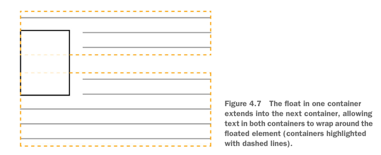
about float
- A floated element is removed from the normal document flow and pulled to the edge of the container, still remaining a part of the flow (in contrast to absolute positioning)
- The document flow then resumes, but it’ll wrap around the space where the floated element now resides
- If you float multiple elements in the same direction, they’ll stack alongside one another
container collapsing
- why — Floated elements don't use any height, need to fix float elements overflow the container
- occur when — If an element contains only floated elements, or contains width limited floated elements
- fix
- flex fix — wrap the container with a new
display: flexcontainer display: flow-rootfix — create a new block formatting context without any other potentially problematic side-effects- overflow fix — add
overflow: hidden | auto(actually value other thanvisible) to the container - clearfixor
#container::after { content: ""; /* or " " */ display: block; clear: both; }.clearfix::before, .clearfix::after { display: table; /* prevents margin collapsing */ content: " "; } .clearfix::after { clear: both; }
- flex fix — wrap the container with a new
- why — Floated elements don't use any height, need to fix float elements overflow the container
Unexpected “float catching”

.media:nth-child(odd) { clear: left; }float— float, allowing text and inline elements to wrap around itleft | right | none | inline-start | inline-end- implies the use of the block layout, it modifies the computed value of the
display, typically toblock cssFloatin JavaScript —floatis reserved,styleFloatfor IE8 and earlier- experimental —
inline-start | inline-end - example, two-column
.media {
  float: left;
  width: 50%;
  padding: 1.5em;
  background-color: #eee;
  border-radius: 0.5em;
}
- implies the use of the block layout, it modifies the computed value of the
clear— whether an element can be next to earlier floating elementsnone | left | right | both- experimental —
inline-start | inline-end - only works when applied to block-level elements
- applies to both floating and non-floating elements
- experimental —
# Flex
flex
- container —
display: flexorinline-flex - direct children of the flex container become flex items
- child elements will become the same height by default
- main axis, cross axis
- philipwalton/flexbugs: A community-curated list of flexbox issues and cross-browser workarounds for them. (opens new window)
- container —
flex-flow<'flex-direction'> || <'flex-wrap'>flex-direction— main axisrow | row-reverse | column | column-reverse- in sync with
dir=- for example, if the
dirattribute isrtl,rowrepresents the axis oriented from the right to the left, androw-reversefrom the left to the right.
- for example, if the
- in sync with
flex-wrapnowrap | wrap | wrap-reversewrap-reverse— Behaves the same aswrapbut cross-start and cross-end are permuted.
order— the order to lay out an item in a flex or grid container<integer>- can be negative
- only meant to affect the visual order of elements and not their logical or tab order
flex— flex item sizenone | [ <'flex-grow'> <'flex-shrink'>? || <'flex-basis'> ]- special values
none—0 0 autoauto—1 1 autoinitial—0 1 auto
flex-basis— sets the initial main size ofbox-sizingcontent | <'width'>- prior —
flex-basis(other thanauto) is more prior thanwidth(orheightin case offlex-direction: column)auto— initial value, use thewidthof the element
contentexperimental
- prior —
flex-grow— weight of remaining space left byflex-basis<number>flex-shrink— weight of shrink whenflex-basisresults in overflow<number>
- special values
flex container spacing —
place-content<'align-content'> <'justify-content'>?justify-content— how the browser distributes space between and around content items along the main-axis of a flex containernormal | <content-distribution> | <overflow-position>? [ <content-position> | left | right ] where <content-distribution> = space-between | space-around | space-evenly <overflow-position> = unsafe | safe <content-position> = center | start | end | flex-start | flex-end<overflow-position>,start,end,leftandrightcurrently has no effect on Chromespace-*— the space between edges and items increases
align-content—justify-contentin cross axisnormal | <baseline-position> | <content-distribution> | <overflow-position>? <content-position> where <baseline-position> = [ first | last ]? baseline <content-distribution> = space-between | space-around | space-evenly | stretch <overflow-position> = unsafe | safe <content-position> = center | start | end | flex-start | flex-end<overflow-position>,first,last,start,end,leftandrightcurrently has no effect on Chrome
flex container alignment
align-items— In Flexbox it controls the alignment of items on the Cross Axis, sets thealign-selfvalue on all direct children as a group

normal | stretch | <baseline-position> | [ <overflow-position>? <self-position> ] where <baseline-position> = [ first | last ]? baseline <overflow-position> = unsafe | safe <self-position> = center | start | end | flex-start | flex-end<overflow-position>,start,end,firstandlastcurrently has no effect on Chrome
flex item spacing
margin: auto— flexbox allows you to usemargin: autoto fill available space between the flex items
flex item alignment —
align-self, overriding thealign-itemsauto | <'align-items'>
# grid
# use grid
grid
display: grid,display: inline-grid- like table, but easier and more versatile
- grid line — horizontal and vertical dividing lines of the grid
- can always be referred to by their numerical index starting from 1
- can be named in
grid-template* - one line can have multiple names and one name can corresponds to multiple lines
- grid track — generic term for a grid column or grid row
- grid area — the logical space used to lay out one or more grid items. A grid area consists of one or more adjacent grid cells
- can be named
- can be implicitly named if surrounding lines named
*-start,*-end
- explicit grid — defined in
grid-template* - implicit grid — grid items can still be placed outside of these explicit tracks; in which case, implicit tracks will be automatically generated, expanding the grid so it contains these elements
- no impact on negative integer when referring grids
- nesting — the grid items of the inner grid will not necessarily align to the grid tracks of the outer grid
- examples (opens new window)
grid item placement algorithm —
grid-auto-flow[ row | column ] || dense- When you don’t specifically position items on a grid, By default, this algorithm places grid, items column by column, row by row, according to the order of the items in the markup. When an item doesn’t fit in one row (that is, it spans too many grid tracks), the algorithm moves to the next row, looking for space large enough to accommodate the item
dense— attempts to fill in holes earlier in the grid, if smaller items come up later. This may cause items to appear out-of-order
grid data types and functions
<flex>data type — the track’s flex factor<number>fr- a non-negative dimension with the unit
fr - The
frunit represents a fraction of the leftover space in the grid container - When appearing outside a
minmax()notation, it implies an automatic minimum (i.e.minmax(auto, <flex>)).
- a non-negative dimension with the unit
- breadth
<track-breadth> = <inflexible-breadth> | <flex> where <inflexible-breadth> = <fixed-breadth> | min-content | max-content | auto where <fixed-breadth> = <length-percentage> minmax()function — defines a size range greater than or equal to min (1st argument) and less than or equal to max (2nd argument)minmax( <track-breadth>, <track-breadth> )fit-content()function — clamps a given size to an available sizefit-content( <length-percentage> )- equivalent to
min(maximum size, max(minimum size, argument)) - i.e. the medium of
max-content,autoand argument
- equivalent to
repeat()function — a repeated fragment of the track list, allowing a large number of columns or rows that exhibit a recurring pattern to be written in a more compact form.repeat( [ <positive-integer> | auto-fill | auto-fit ] , <track-list> ) where <track-list> = [ <line-names>? [ <track-size> | <track-repeat> ] ]+ <line-names>? where <line-names> = '[' <custom-ident>* ']' <track-size> = <track-breadth> | minmax( <inflexible-breadth> , <track-breadth> ) | fit-content( [ <length> | <percentage> ] ) <track-repeat> = repeat( [ <positive-integer> ] , [ <line-names>? <track-size> ]+ <line-names>? )- can’t be nested
- Automatic repetitions (
auto-fillorauto-fit) cannot be combined with intrinsic or flexible sizes. auto-fill- the largest possible positive integer that does not cause the grid to overflow its grid container if the container constrains
- Otherwise, as its minimum track sizing function, and taking grid-gap into account
auto-fit—auto-fillbut any empty repeated tracks are collapsed
# Set Grid: Size and Spacing
grid— a shorthand property that sets all of the explicit grid properties, and all the implicit grid properties<'grid-template'> | <'grid-template-rows'> / [ auto-flow && dense? ] <'grid-auto-columns'>? | [ auto-flow && dense? ] <'grid-auto-rows'>? / <'grid-template-columns'>grid-template— set explicit column and row tracks, and/or named grid areas and grid linesnone | [ <'grid-template-rows'> / <'grid-template-columns'> ] | [ <line-names>? <string> <track-size>? <line-names>? ]+ [ / <explicit-track-list> ]? where <explicit-track-list> = [ <line-names>? <track-size> ]+ <line-names>?grid-template-rows— defines the line names and track sizing functions of the grid rows.none | <track-list> | <auto-track-list> where <auto-track-list> = [ <line-names>? [ <fixed-size> | <fixed-repeat> ] ]* <line-names>? <auto-repeat> [ <line-names>? [ <fixed-size> | <fixed-repeat> ] ]* <line-names>? where <fixed-size> = <fixed-breadth> | minmax( <fixed-breadth> , <track-breadth> ) | minmax( <inflexible-breadth> , <fixed-breadth> ) <fixed-repeat> = repeat( [ <positive-integer> ] , [ <line-names>? <fixed-size> ]+ <line-names>? ) <auto-repeat> = repeat( [ auto-fill | auto-fit ] , [ <line-names>? <fixed-size> ]+ <line-names>? )grid-template-columnsnone | <track-list> | <auto-track-list>grid-template-area— specifies named grid areasnone | <string>+- A row is created for every separate string listed, and a column is created for each cell in the string
- Multiple named cell tokens within and between rows create a single named grid area that spans the corresponding grid cells
- Unless those cells form a rectangle, the declaration is invalid.
- implicitly named grid line with the same name, with suffix
-start,-end - example
grid-template-areas:
            "a a ."
            "a a ."
            ". b c";
size of implicit grid tracks —
grid-auto-column,grid-auto-row<track-size>+spacing —
gap, akagrid-gap(gapis replacing this one)<'row-gap'> <'column-gap'>?- lack browser support in flex layout
row-gap, akagrid-row-gapnormal | <length-percentage>normal— 0 or1em
column-gap, akagrid-column-gapnormal | <length-percentage>
grid item size —
grid-area, a shorthand<grid-line> [ / <grid-line> ]{0,3} where <grid-line> = auto | <custom-ident> | [ <integer> && <custom-ident>? ] | [ span && [ <integer> || <custom-ident> ] ]grid-column,grid-row<grid-line> [ / <grid-line> ]?grid-row-start,grid-column-start,grid-row-endandgrid-column-end<grid-line><custom-ident>- use
<custom-ident>with suffix-startor-end, corresponding to rule name - otherwise, equivalent to
1 <custom-ident>
- use
<integer> && <custom-ident>?- nth grid line
- If a negative integer is given, it instead counts in reverse
- if
<custom-ident>given, only lines with that name are counted- If not enough lines with that name exist, all implicit grid lines are assumed to have that name
span && [ <integer> || <custom-ident> ]- the start edge is n lines from the end, or vice versa
- If the
<integer>is omitted, it defaults to 1. Negative integers or 0 are invalid. - if
<custom-ident>given, only lines with that name are counted- If not enough lines with that name exist, all implicit grid lines on the side of the explicit grid corresponding to the search direction are assumed to have that name
# alignment of grid items
auto— auto track sizes (and only auto track sizes) can be stretched by thealign-contentandjustify-contentproperties.grid container space distribution —
place-content<'align-content'> <'justify-content'>?justify-content— how the browser distributes space between and around content items along the inline axis of a grid containernormal | <content-distribution> | <overflow-position>? [ <content-position> | left | right ] where <content-distribution> = space-between | space-around | space-evenly | stretch <overflow-position> = unsafe | safe <content-position> = center | start | end | flex-start | flex-endalign-content—justify-contentin the other directionnormal | <baseline-position> | <content-distribution> | <overflow-position>? <content-position> where <baseline-position> = [ first | last ]? baseline
grid item space distribution within one's grid area —
place-item<'align-items'> <'justify-items'>?justify-item— inline axis, setjustify-selfon all direct childrennormal | stretch | <baseline-position> | <overflow-position>? [ <self-position> | left | right ] | legacy | legacy && [ left | right | center ] where <baseline-position> = [ first | last ]? baseline <overflow-position> = unsafe | safe <self-position> = center | start | end | self-start | self-end | flex-start | flex-endalign-item— block axis, setalign-selfon all direct childrennormal | stretch | <baseline-position> | [ <overflow-position>? <self-position> ]
space distribution within one grid area of a single grid item
justify-self<'justify-item'>align-self<'align-item'>
# Positioning and stacking
containing block
static,relative— formed by the edge of the content box of the nearest ancestor element that is a block container or establishes a formatting contextabsolute— formed by the edge of the padding box of the nearest ancestor element that has apositionvalue other thanstatic- use
position: relativein parent element
- use
fixed— established by the viewport (in the case of continuous media) or the page area (in the case of paged media)- other conditions
positionstatic | relative | absolute | sticky | fixedsticky—relativeandfixedhybrid: normal flow, then offset relative to its nearest scrolling ancestor and containing block
top,left,bottom,right— position of a positioned element<length> | <percentage> | autostacking context
- form a stacking context
- Root element of the document (
<html>). - Element with a position value absolute or relative and z-index value other than auto.
- Element with a position value fixed or sticky (sticky for all mobile browsers, but not older desktop).
- Element that is a child of a flex (flexbox) container, with z-index value other than auto.
- Element that is a child of a grid (grid) container, with z-index value other than auto.
- Element with a opacity value less than 1 (See the specification for opacity).
- Element with any of the following properties with value other than none:
- transform
- filter
- perspective
- clip-path
- mask / mask-image / mask-border
- Element with a isolation value isolate.
- Element with a mix-blend-mode value other than normal.
- Element with a -webkit-overflow-scrolling value touch.
- Element with a will-change value specifying any property that would create a stacking context on non-initial value (see this post).
- Element with a contain value of layout, or paint, or a composite value that includes either of them (i.e. contain: strict, contain: content).
- Root element of the document (
- Within a stacking context, child elements are stacked
- the
z-indexvalues of its child stacking contexts only have meaning in this parent
- the
- form a stacking context
z-indexauto | <integer>auto— The box does not establish a new local stacking context. The stack level of the generated box in the current stacking context is the same as its parent's box.<integer>— This<integer>is the stack level of the generated box in the current stacking context. The box also establishes a local stacking context in which its stack level is 0. This means that the z-indexes of descendants are not compared to the z-indexes of elements outside this element.
isolation— whether an element must create a new stacking contextauto | isolate- helpful when using
mix-blend-mode
- helpful when using
# Animation
- docs and resources
# transition
about transition
- Transitions enable you to define the transition between two states of an element
- Different states may be defined using pseudo-classes like
:hoveror:activeor dynamically set using JavaScript.
transition— shorthand<single-transition># where <single-transition> = [ none | <single-transition-property> ] || <time> || <timing-function> || <time> where <single-transition-property> = all | <custom-ident> <timing-function> = linear | <cubic-bezier-timing-function> | <step-timing-function> where <cubic-bezier-timing-function> = ease | ease-in | ease-out | ease-in-out | cubic-bezier(<number>, <number>, <number>, <number>) <step-timing-function> = step-start | step-end | steps(<integer>[, <step-position>]?) where <step-position> = jump-start | jump-end | jump-none | jump-both | start | endtransition-property— the CSS properties to which a transition effect should be appliednone | <single-transition-property>#- master list for follow rules
transition-duration— the length of time a transition animation should take to complete<time>#- may specify multiple durations; each duration will be applied to the corresponding property as specified by the
transition-propertyproperty
- may specify multiple durations; each duration will be applied to the corresponding property as specified by the
transition-timing-function— how intermediate values are calculated for CSS properties being affected by a transition effect.<timing-function>#- each will be applied to the corresponding property as specified by the
transition-propertyproperty
- each will be applied to the corresponding property as specified by the
transition-delay— the duration to wait before starting a property's transition effect when its value changes<time>#- each will be applied to the corresponding property as specified by the
transition-propertyproperty
- each will be applied to the corresponding property as specified by the
# animation
animation@keyframes
# Browser Quirks
utilities
fix
<main>inline by default in some browsersmain { display: block; }